


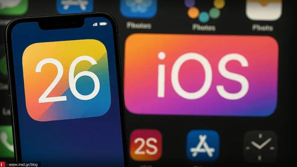

After the wave of negative comments about the "awful" - as many testers called it - new Liquid Glass design of iOS 26, Apple folded.

In the third developer beta (beta 3) he froze the translucent elements even more, darkening the navigation bars, notifications and buttons to make the text easier to read.
Comparative shots were published showing that the UI of beta 3 is much more "milky" and distinct than the first beta, in which the intense transparency made everyday use difficult.
The initial versions had accessibility problems: icons in the Control Center "blended" into the background, while colors left little contrast.
Read also: iOS 26 Beta 2: Upgrades and hints for the future iPhone 17 Air
The Verge notes that many users feel that Apple is "undermining" its bold vision, while others welcome the change as necessary for better readability.
Apple traditionally launches the public version of iOS along with the new iPhones in September. There may be more adjustments between now and then, especially if the complaints continue.
Liquid Glass remains, but has become "colder". Apple seems to have found a middle ground between striking aesthetics and usability, but the debate about how radical (or not) the design of iOS 26 should be continues.
Read also: iOS 26: Fixes the battery problem in the newest Developer Beta